- You’ll build
- Interactive Tabs in WordPress
- Code required
- HTML + CSS + JS
- Installation
- Theme and role dependent
On this page
Before you startHow the tabs workInstall the component in WordPressCustomize content and stylingAdd or remove a tabTroubleshoot tab behaviorAccessibility and performanceFrequently asked questionsCheck your installationComplete working code
The preview and download are generated from these same source files. The complete snippet requires permission to save inline styles and scripts.
<section class="iljs-demo iljs-tabs"><div role="tablist" aria-label="Project details"><button id="iljs-tab-1" role="tab" aria-selected="true" aria-controls="iljs-panel-1">Design</button><button id="iljs-tab-2" role="tab" aria-selected="false" aria-controls="iljs-panel-2" tabindex="-1">Build</button><button id="iljs-tab-3" role="tab" aria-selected="false" aria-controls="iljs-panel-3" tabindex="-1">Launch</button></div><div id="iljs-panel-1" role="tabpanel" aria-labelledby="iljs-tab-1" tabindex="0"><span>01 / START WITH AN IDEA</span><h2>Make room for possibility.</h2><p>Choose a direction, gather your content, and decide what visitors need.</p></div><div id="iljs-panel-2" role="tabpanel" aria-labelledby="iljs-tab-2" tabindex="0" hidden><span>02 / BRING IT TO LIFE</span><h2>Build one good thing.</h2><p>Work in small steps. Try your changes before publishing them.</p></div><div id="iljs-panel-3" role="tabpanel" aria-labelledby="iljs-tab-3" tabindex="0" hidden><span>03 / SHARE YOUR WORK</span><h2>Ready when you are.</h2><p>Check your links, keyboard controls, and narrow-screen layout before launch.</p></div></section>
/* Change the values here, keeping the iljs- prefix to avoid theme conflicts. */
.iljs-demo { --iljs-accent:#9235f6; --iljs-radius:18px; font-family:system-ui,sans-serif; color:#242038; width:min(620px,100%); margin:auto; }
.iljs-demo button,.iljs-demo a { font:inherit; }
.iljs-demo button:focus-visible,.iljs-demo a:focus-visible,.iljs-demo input:focus-visible,.iljs-demo summary:focus-visible { outline:3px solid #c491ff; outline-offset:4px; }
.iljs-tabs { max-width:540px;border:1px solid #e5d5f1;border-radius:var(--iljs-radius);overflow:hidden;background:#fff; }
.iljs-tabs [role="tablist"] { display:flex;background:#f8f2ff;padding:10px;gap:8px; }
.iljs-tabs [role="tab"] { flex:1;border:0;padding:11px;background:none;color:#8b769a;border-radius:7px;cursor:pointer;font-size:13px; }
.iljs-tabs [aria-selected="true"] { background:#fff;box-shadow:0 3px 10px #4c21600b;color:var(--iljs-accent); }
.iljs-tabs [role="tabpanel"] { padding:32px;min-height:180px; }
.iljs-tabs [role="tabpanel"][hidden] { display:none; }
.iljs-tabs [role="tabpanel"] span { font-size:9px;letter-spacing:1px;color:#a17ebc; }
.iljs-tabs h2 { font-size:26px;line-height:1.15;margin:17px 0; }
.iljs-tabs p { font-size:13px;color:#867390;line-height:1.8; }
(() => {
 const init=()=>document.querySelectorAll('.iljs-tabs').forEach(root=>{
  if(root.dataset.iljsReady)return;root.dataset.iljsReady='true';const tabs=[...root.querySelectorAll('[role="tab"]')];const panels=[...root.querySelectorAll('[role="tabpanel"]')];
  const select=index=>{tabs.forEach((tab,i)=>{tab.setAttribute('aria-selected',String(i===index));tab.tabIndex=i===index?0:-1;panels[i].hidden=i!==index;});};
  tabs.forEach((tab,i)=>{tab.addEventListener('click',()=>select(i));tab.addEventListener('keydown',event=>{let next=i;if(event.key==='ArrowRight')next=(i+1)%tabs.length;else if(event.key==='ArrowLeft')next=(i-1+tabs.length)%tabs.length;else if(event.key==='Home')next=0;else if(event.key==='End')next=tabs.length-1;else return;event.preventDefault();select(next);tabs[next].focus();});});
 });document.readyState==='loading'?document.addEventListener('DOMContentLoaded',init,{once:true}):init();
})();
<section class="iljs-demo iljs-tabs"><div role="tablist" aria-label="Project details"><button id="iljs-tab-1" role="tab" aria-selected="true" aria-controls="iljs-panel-1">Design</button><button id="iljs-tab-2" role="tab" aria-selected="false" aria-controls="iljs-panel-2" tabindex="-1">Build</button><button id="iljs-tab-3" role="tab" aria-selected="false" aria-controls="iljs-panel-3" tabindex="-1">Launch</button></div><div id="iljs-panel-1" role="tabpanel" aria-labelledby="iljs-tab-1" tabindex="0"><span>01 / START WITH AN IDEA</span><h2>Make room for possibility.</h2><p>Choose a direction, gather your content, and decide what visitors need.</p></div><div id="iljs-panel-2" role="tabpanel" aria-labelledby="iljs-tab-2" tabindex="0" hidden><span>02 / BRING IT TO LIFE</span><h2>Build one good thing.</h2><p>Work in small steps. Try your changes before publishing them.</p></div><div id="iljs-panel-3" role="tabpanel" aria-labelledby="iljs-tab-3" tabindex="0" hidden><span>03 / SHARE YOUR WORK</span><h2>Ready when you are.</h2><p>Check your links, keyboard controls, and narrow-screen layout before launch.</p></div></section>

<style>
/* Change the values here, keeping the iljs- prefix to avoid theme conflicts. */
.iljs-demo { --iljs-accent:#9235f6; --iljs-radius:18px; font-family:system-ui,sans-serif; color:#242038; width:min(620px,100%); margin:auto; }
.iljs-demo button,.iljs-demo a { font:inherit; }
.iljs-demo button:focus-visible,.iljs-demo a:focus-visible,.iljs-demo input:focus-visible,.iljs-demo summary:focus-visible { outline:3px solid #c491ff; outline-offset:4px; }
.iljs-tabs { max-width:540px;border:1px solid #e5d5f1;border-radius:var(--iljs-radius);overflow:hidden;background:#fff; }
.iljs-tabs [role="tablist"] { display:flex;background:#f8f2ff;padding:10px;gap:8px; }
.iljs-tabs [role="tab"] { flex:1;border:0;padding:11px;background:none;color:#8b769a;border-radius:7px;cursor:pointer;font-size:13px; }
.iljs-tabs [aria-selected="true"] { background:#fff;box-shadow:0 3px 10px #4c21600b;color:var(--iljs-accent); }
.iljs-tabs [role="tabpanel"] { padding:32px;min-height:180px; }
.iljs-tabs [role="tabpanel"][hidden] { display:none; }
.iljs-tabs [role="tabpanel"] span { font-size:9px;letter-spacing:1px;color:#a17ebc; }
.iljs-tabs h2 { font-size:26px;line-height:1.15;margin:17px 0; }
.iljs-tabs p { font-size:13px;color:#867390;line-height:1.8; }


</style>
<script>
(() => {
 const init=()=>document.querySelectorAll('.iljs-tabs').forEach(root=>{
  if(root.dataset.iljsReady)return;root.dataset.iljsReady='true';const tabs=[...root.querySelectorAll('[role="tab"]')];const panels=[...root.querySelectorAll('[role="tabpanel"]')];
  const select=index=>{tabs.forEach((tab,i)=>{tab.setAttribute('aria-selected',String(i===index));tab.tabIndex=i===index?0:-1;panels[i].hidden=i!==index;});};
  tabs.forEach((tab,i)=>{tab.addEventListener('click',()=>select(i));tab.addEventListener('keydown',event=>{let next=i;if(event.key==='ArrowRight')next=(i+1)%tabs.length;else if(event.key==='ArrowLeft')next=(i-1+tabs.length)%tabs.length;else if(event.key==='Home')next=0;else if(event.key==='End')next=tabs.length-1;else return;event.preventDefault();select(next);tabs[next].focus();});});
 });document.readyState==='loading'?document.addEventListener('DOMContentLoaded',init,{once:true}):init();
})();

</script>Before you start
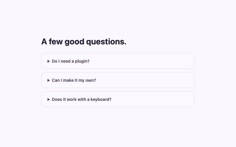
Keep essential instructions available where visitors will find them. A tab interface hides inactive panels visually, so it should not bury an important warning. For independent questions whose answers can stay open together, the native FAQ accordion may be more suitable.
How the tabs work
The tablist contains three buttons with role="tab". Each button has a unique ID and aria-controls pointing to its corresponding panel. Each panel has role="tabpanel" and aria-labelledby pointing back to its tab. These relationships let assistive technology identify the control and the content it selects.
The first tab begins with aria-selected="true". The others have tabindex="-1", so pressing Tab enters the group through the selected control rather than visiting every inactive tab in sequence. Inactive panels use the hidden attribute, which removes their content from rendering and the ordinary focus sequence.
JavaScript gathers tabs and panels inside one .iljs-tabs root. The select function updates the selection state, tab indexes, and panel visibility in one pass. Arrow Left and Arrow Right wrap around the tab group; Home selects the first tab, and End selects the last. Selection follows focus because these small local panels do not require a network request to display.
Install the component in WordPress
- Add a Custom HTML block to a draft page and paste the markup. Keep the tablist before the panels and preserve the relationship attributes.
- Replace the three labels and each panel’s text. Do not change IDs in only one place: the matching
aria-controlsandaria-labelledbymust change together. - Install the CSS through an available Additional CSS interface or approved stylesheet. The custom CSS guide covers theme differences.
- Install the JavaScript using a permitted path. Read the JavaScript setup guide before embedding a script that your role might not be allowed to save.
- Save and inspect the front end. Test clicking every tab, keyboard arrows, Home, End, and tabbing from a selected tab into its panel.
The page-level structure can be used in block themes, classic themes, or an Elementor HTML widget when the account’s permissions allow it. WordPress 7.0’s JavaScript panel requires unfiltered_html; restricted roles or hosting may need an approved enqueue method. This component depends on JavaScript to expose all three panels through the supplied controls. If your installation cannot run the script, use ordinary headings and visible sections instead of leaving unreachable hidden content.
Customize content and styling
The tablist’s pale background separates controls from content. Selected tabs receive a white surface, a small shadow, and the accent color. Change --iljs-accent for selected text, and edit the list background if your brand needs a different palette. Check the inactive tab text contrast as well as the active control.
Panel padding is 32 pixels and the minimum height is 180 pixels. A minimum can reduce visible jumping for similar-length panels, but it does not clip longer content. Avoid replacing it with a fixed height when your actual text needs more space. Let the panel grow naturally on phones.
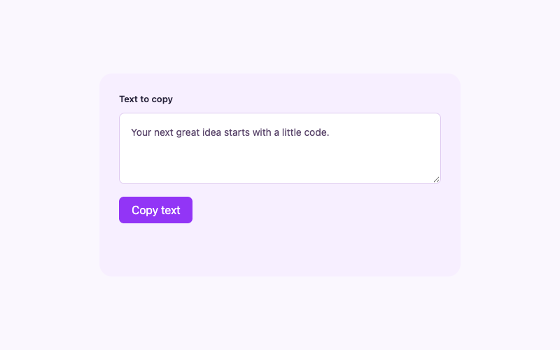
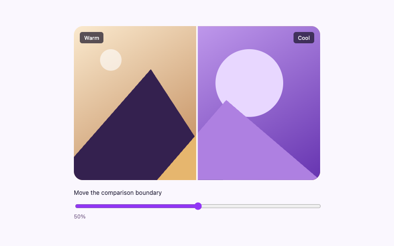
Add ordinary semantic content inside panels. A copy-to-clipboard component can work inside a panel because it initializes without relying on a measured width. An image comparison slider also uses a percentage-based layout. Test nested controls to ensure arrow keys on the tab group do not interfere with inputs inside a panel; this implementation listens only on the tabs themselves.
Add or remove a tab
To add a fourth tab, add one new button and one matching panel. Use unique IDs such as iljs-tab-4 and iljs-panel-4, and keep the tab and panel order aligned. Give the new tab aria-selected="false" and tabindex="-1"; give its panel hidden. The script automatically uses the number of tabs it finds.
To remove a tab, remove its matching panel too. A mismatch between the two arrays would leave selection behavior incomplete. When copying the entire component multiple times on one page, prefix every ID in the second instance with another unique value and update both relationship directions. Reusable classes are fine, but IDs cannot repeat. The WordPress class and ID guide helps with that distinction.
Do not turn the tab buttons into anchors with fake href="#" values. These controls change local interface state rather than navigate. If the content needs independent linkable pages, a navigation list of real anchors is a better model.
Troubleshoot tab behavior
Only Design is visible and nothing changes. The CSS and initial hidden states may have loaded without the script. Check whether WordPress stripped JavaScript or whether the installed file failed to load.
The wrong panel opens. Confirm the button and panel order match. Check the IDs and ARIA relationships, especially after copying the component or adding a tab.
Every panel is visible. A theme’s display rule may override the hidden state. Keep the explicit [role="tabpanel"][hidden] { display: none; } rule and inspect higher-specificity declarations.
Arrow navigation stops at the first or last tab. The supplied handler wraps using the actual tab count. Verify that a customization did not replace the key names or the modulo calculation.
Focus is invisible. Restore the shared :focus-visible outline. A selected background alone is not a focus indication, because selection and keyboard focus are related but distinct states.
Accessibility and performance
The control uses a conventional horizontal tab pattern. Arrow keys move within the group; Tab continues into the active panel and onward. There is no modal focus trap and no forced animation. Panels are already present in the HTML, so switching does not fetch content or send a visitor’s selection to a service.
Keep labels short enough for a narrow screen, but do not abbreviate them beyond recognition. If you need many tabs, consider another structure or a carefully designed horizontal scroll area. Test actual labels at 320 pixels and with larger text. Do not assume three sample words prove every possible content layout works.
Frequently asked questions
Can I show a tab by its URL hash?
This version does not synchronize tabs with the URL. Adding that behavior requires interpreting the hash and preserving correct state and focus. Use separate pages when direct linking is central to the content.
Does content load only when selected?
No. The panels are local HTML. That makes switching immediate, but it also means any images or embedded services need their own loading strategy.
Can tabs contain forms?
Yes, with careful focus and validation testing. Do not switch away from a panel automatically while someone is editing it, and ensure errors identify the relevant panel.
Check your installation
Click and keyboard-select every tab, inspect the panel relationships, and confirm no content becomes unreachable when your chosen script installation path fails. Keep a plain-section alternative for environments that cannot run the behavior.